May 11, 2021
When I found out I was pregnant I was just beside myself with excitement. Like most newly pregnant moms I started reading and researching everything I could get my hands on (which was a lot since I had terrible pregnancy insomnia and read most of the night). What would I need to be ‘baby ready’? How much would I sleep with a newborn? What would I need for a baby nursery? What were the baby ‘Must Haves’ for a first time mom and what could I do with out? What was on my nursery decor checklist? I’m pretty sure I got carpal tunnel scrolling Pinterest looking for nursery ideas and ultimately decided that whatever I was going to do I wanted to make sure that the nursery design could 1. Grow with my child 2. Be gender neutral 3. Encourage and Inspire her. I wanted the room to be dark enough for her to sleep but also bright and happy. I wanted a nursery theme but nothing that would make it so that the design couldn’t easily be changed or shifted when she got older. I also wanted to make sure that I could keep the nursery easily organized and have plenty of extra storage for baby toys.
Here’s what I landed on for the nursery design and how I got there.
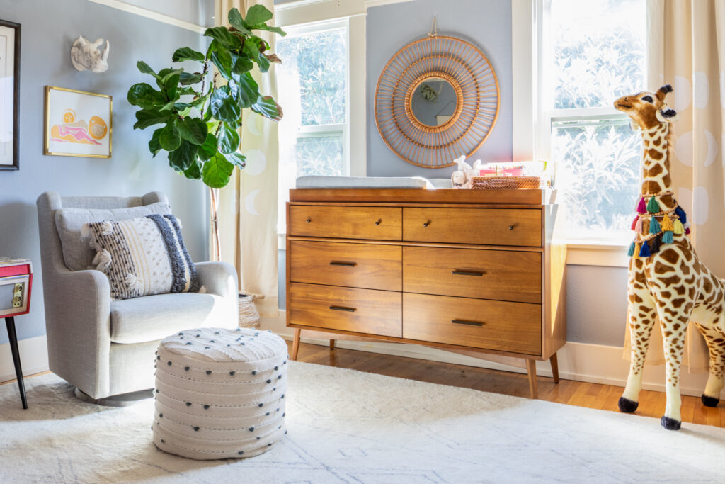
When I was looking for nursery furniture I wanted to choose pieces that could work in other rooms if we moved or that could transition with our child as she got older. I knew that this room had the potential to feel very busy and chaotic so I kept the larger nursery furniture pieces more neutral because I didn’t want the design to have to compete with brightly colored baby toys. Too much visual noise.
Since Corey and err on the side of a more mid-century look I picked the Acorn dresser from West Elm with a changing table attachment. We have the same dresser in our room and the changing table part can be easily removed and stored for when she grows out of that need. I added a mirror above the changing table because I knew I would want to show her how she looks when I got her ready in the morning, admire my new baby in my arms and it is also helpful for newborns to look at their reflection developmental growth.
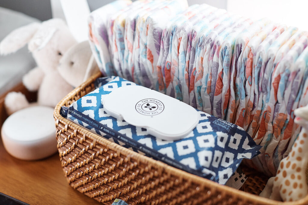
I added some pretty baskets from Crate and Barrel to keep her diaper station organized with baby essentials on hand and at the ready. I also kept the top drawer in the dresser filled with back stock diapers and wipes and anything we would’t want to scramble to look for like gas drops, a nosefrida (gross but effective), teething oil, teethers, extra pacifiers, etc. I also created the same diaper basket (with those items) for the areas in the house we frequent so we didn’t always have to go to her nursery to change her or look for baby essentials (also a helpful grab bag for anyone watching the baby).
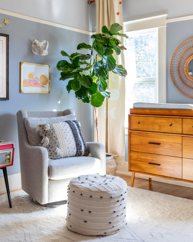
We didn’t know how to anticipate a newborn sleep schedule so we only chose what felt like baby sleeping essentials to us. Blackout curtains, glider, and white noise machine. I picked neutral blackout curtains from Crate and Barrel kids (fun option here) but most places will offer a blackout option for any curtain you choose.
When we were looking for a nursery chair I opted for glider because I had horrible thoughts of accidentally squashing little fingers. Corey picked the Milo glider from Crate and Barrel Kids and it is seriously the most comfortable thing ever. We got it in the Lin, grey color so that it would be easy to clean and hide spit up (which it does well). I added the ottoman from CB2 (similar here) that was playful and blended all the furniture nicely with the super soft and fun for crawling rug (so plush).
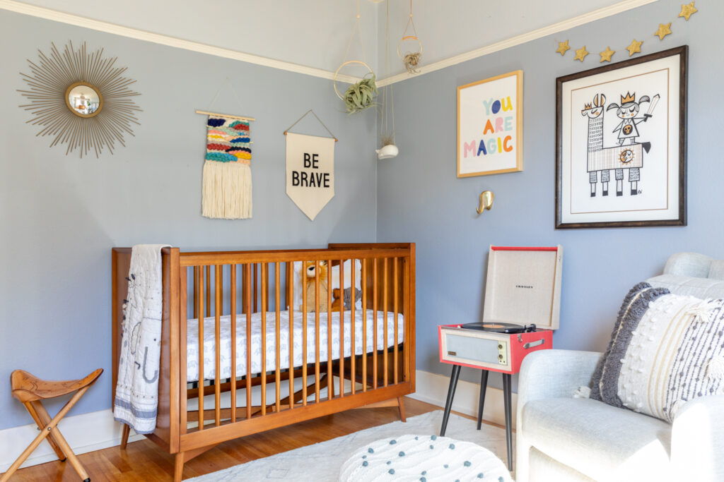
For the nursery crib we went with (you guessed it) the Acorn crib from West Elm. I loved the simple design and the fact that it went with the other big furniture piece in her room. My only qualm is that you can’t drop the sides to bend over into the crib. I’m pretty short so I had to bend over pretty far to get Poppy out of bed when we lowered the mattress. For me it is not a deterrent but for others it might be.
The record player was a gift for me from Corey that we ultimately moved into her room and she really enjoys it. When she was little we would play David Bowie for her and she would calm right down (cool kid). The little stool next to the crib used to be in my Mom’s room in my Grandma’s house. There are buffalos, arrows, and stars burned into the seat and I have always loved it.
I had a VERY hard time picking a mobile for her room. It’s not necessary but I wanted to have that detail for her. I decided to go with some hanging air plants as a point of interest for the corner above her crib, pretty and light.
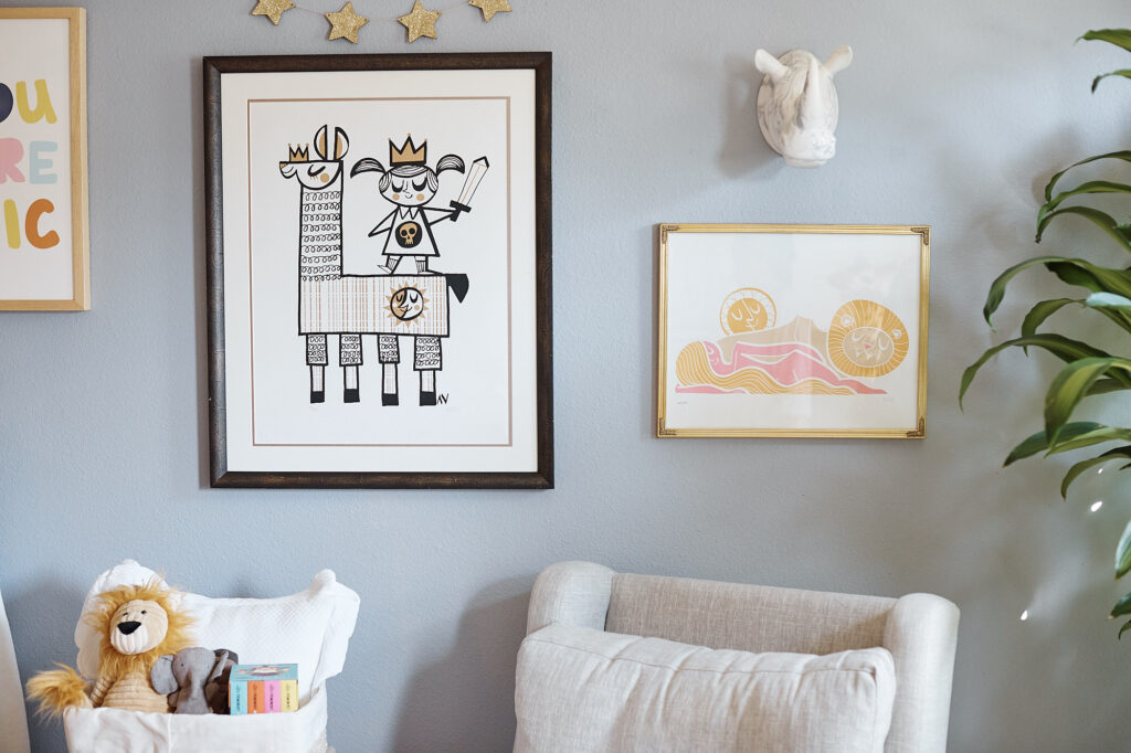
I love the art in Poppy’s room. I basically chose the theme (animals) because of these two prints. The larger black and white piece is called We Are Kings by Amanda Visell and Girl Lion Sun (same artist) are a perfect representation of how I want my daughter to feel. Proud, confident, strong, and radiant, happy, and warm.

You are Magic print from Pottery Barn Kids.

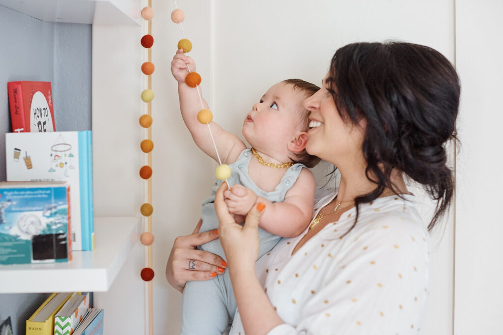
Remember the baby shower?? It was important to me to bring Poppy to the shower and then use that decor to decorate her room. I knew as I was choosing her paint colors that that I was going to use reds, oranges, and yellows as accents for the shower and for her room. I chose colors that you will find in wild Poppies.

I brought in the Solstice planter from Black Mountain ceramics for my summer solstice baby and used it again as inspiration for her first birthday. I make it an aim to have reason behind most of design choices and then the accidental design seems to just fall into place.

Did you like designing your nursery? Do you want more nursery ideas?
Let me know what you think!
Love and snugs!
xx
-S.
Leave a Reply Cancel reply
home
ABOUT
journal
Find Your Way
Fig & Whiskey is a Los Angeles-based luxury event design house that transforms events into unforgettable, visceral experiences for the senses. Whatever the brand, individual, or occasion, we create elevated environments tailored just for you.
BRAND ACTIVATIONS | LUXURY PARTIES CORPORATE EVENTS | SOCIAL GATHERINGS
SERVICES
our work
Shop
Elevated and Bespoke Event Planning
contact
Hello@figandwhiskey.com | 2024© FIG & WHISKEY

Be the first to comment