February 19, 2021

We moved into our home in LA in 2008, right after I had moved out here from Boston. And when I say we, I mean me, Corey didn’t move in until 2015 (ish). It did NOT look like this when I moved in. This house has seen MANY iterations with roommates and growth but this is the version I love the most because this is the one I created with Corey while we were getting ready for our baby. He jokes that I took nesting to the next level and he is 100% right. I was replacing light fixtures, donating and replacing furniture, painting, and just editing as much as I could so that our home would function at its highest capacity. If something didn’t serve an immediate purpose, out it went. I knew that our home was going to quickly be filled with things for the baby and I didn’t want to start out overwhelmed.
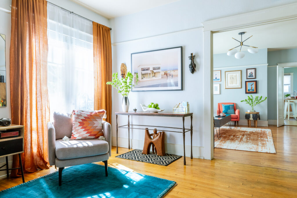
I looked at the things around our house and thought, ‘Will I feel grossed out if the baby is crawling on this or puts it in her mouth?’. The answer was yes to a few of those things including some of the pieces that I had from when I first moved out to LA. A favorite moroccan style runner, a crushed velvet , mustard, club chair that I was OBSESSED with, and our piano. The piano was tough for me. It was old and beautiful and lopsided and a lot of the keys didn’t work but the front of the piano was missing so you could see the ‘guts’ of the piano which was my favorite part. I wound up selling it to another mother who had twin girls. I told her about my nerves about becoming a mom and she reassured me that I would be just fine. She told me that you schedule things around nap time and with some practice we would easily fold the baby into our lives. Looking a side by side of the space then and the space now its so much easier to appreciate that sacrifice.
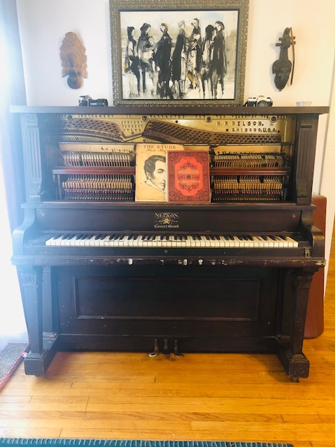
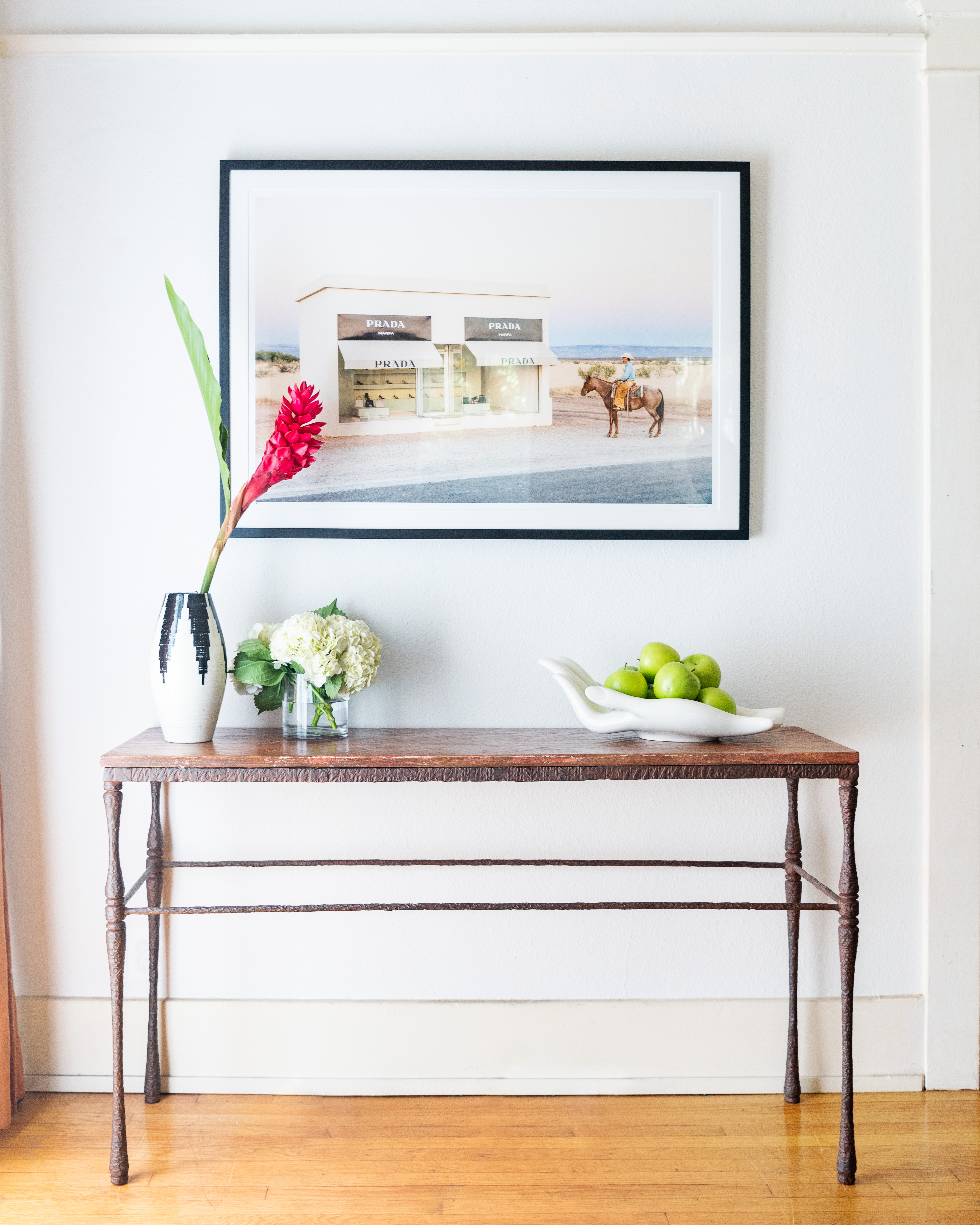
Seeing them side by side feels like a no brainer. I can’t even believe this is the same space.
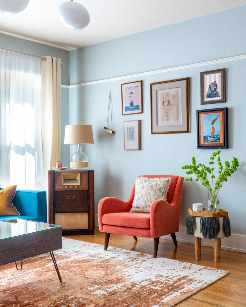
When I was reimagining our space with a baby in it I knew that I wanted things to be easy to find. I wanted our home to still feel like a reflection of us, bright, happy, a little vintage, and a lot of style, and also, with a baby. I made the decision to leave my work in Hollywood and pursue my work designing and styling full time from home. This was also a HUGE motivator in my intense nesting. I knew that if I was going to be working from home with my daughter, I was going to want a space that kept me inspired and not overwhelmed. I swapped our patchwork rug for something that would hide spills and edited out art work to be a little more calm and consistent.
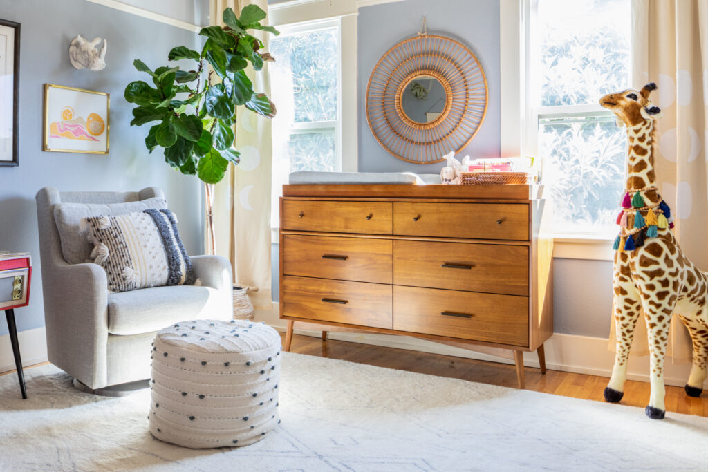
And of course I was SO EXCITED to design her nursery. There were some new mom essentials I knew I needed and some things I had that just happened to work for a kids room (go figure). I wanted to choose pieces that were timeless and would transition easily as she grows. My top essentials were: a super comfy nursing chair, a baby dresser that didn’t look like a baby dresser, inspired art work, blackout curtains (there was no way to know what sleeping was going to be like and I just wanted to get ahead of that). My goal was to keep the nursery light and airy, inspired, colorful but not overwhelming, and organized.
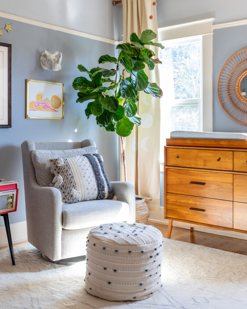
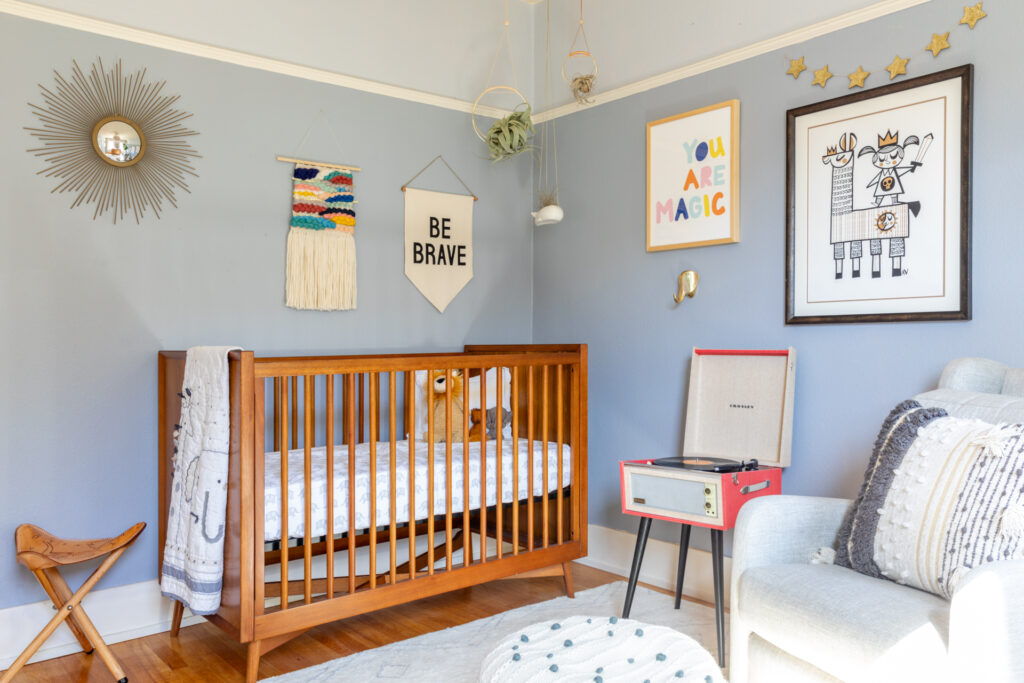
I had a hard time picking art for above the crib that fit all of those requirements and were earthquake safe and baby friendly, but these pieces were JUST the right fit (here, here, here and here). I am very much a subscriber of signage in any space and I just loved these messages for the nursery. I wanted to Poppy to be surrounded by messages of inspiration that felt bold and spoke to the forming of her character but lets be real- for the first few years, this nursery is for mom. I wanted her to learn these lessons but I also wanted to be reminded of them. I love rocking Poppy to sleep while looking around her room and also feeling inspired and encouraged. The transition of motherhood is not easy for everyone. I thought it was going to be easy for me, it wasn’t. More on that later. Crib, record player, and nursery chair linked – this is hands down the most comfy nursery chair we tried and I couldn’t recommend it enough (plus that high back is great support for late nights up with bebe).

I also made sure to put some energy into our bedroom. There is a lot of change that comes with having a baby and a VERY large part of that transition is the one you go through with your partner. Corey and I definitely went through the ringer after we had Poppy, again, a lot to do with me and my transition into motherhood but it is just natural for you to have to relearn who you are and what your routine is with a child. I wanted this space to feel calm and inspiring and make me excited to make the bed and get dressed and snuggle. We have always had a tough time agreeing on bedding color, he likes dark and I like bright and white. We compromised with this emerald green quilt (similar here) that goes over out white duvet and I added accent pillows with pops of orange to tie in the print above the bed.

Shoutout to our butt vase, it’s one of my favorite pieces in the house. Corey got it for me a few years ago, for some reason it reminded him of me 😉 . Also 100% into the oversized side tables for keeping everything organized and Poppy’s favorite place to explore when we are all still in bed in the morning. Side note: don’t keep anything intimate in the drawers that your child might use as a phone. yup, that happened.

Poppy was so tiny here, it just kills me. Look at her little chicken fluff head! Also, this art – one of my and Corey’s bigger art purchases prints found here.

OK. So, my home office was a big deal. I absolutely love this space. It is hands down my favorite room in the house. I feel inspired, excited, charged, motivated, and just like a FU*KING BOSS in here. It is my sanctuary. I wanted to incorporate color without it feeling too busy or loud. I stuck with my favorite teal for my filing cabinet (similar here) which grounds the space and then everything around it feels light and airy.
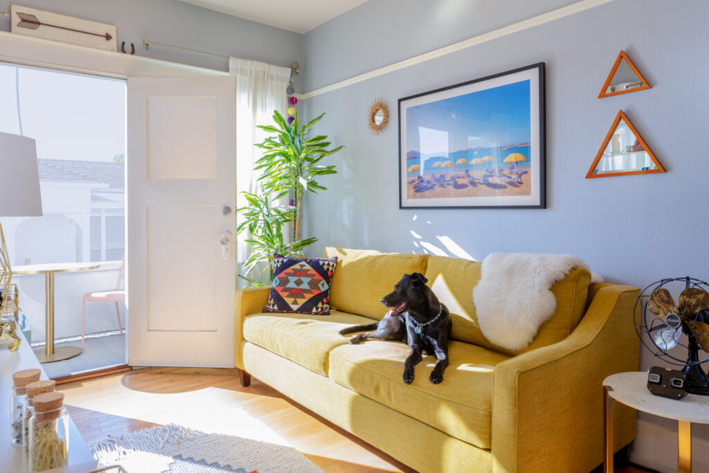
I fell in love with this mustard couch and I knew when I saw the color that it would actually be a perfect fit with subtlety of the pastel green and pops pinks, orange and blue. It makes me happy every time I see it, even when it is covered in props and cake trays.
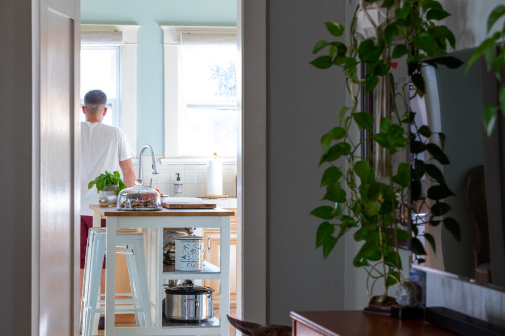
I didn’t realize how much we changed the kitchen even though we didn’t do too much. We added the kitchen island (similar here) which was INCREDIBLY helpful for storage. At first I didn’t think it was going to be a space saver because of how big the piece is but being able to have another place to store appliances, prep meals, keep snacks, and even attach Poppy’s high chair (which was an awesome solution for us to keep her close but keep doing things around the kitchen).
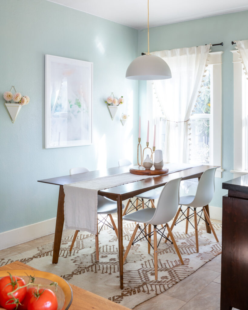
We painted, put in a new, more modern light fixture, and I made Corey drive all the way to Santa Barbra to get this table that was on sale. I used to have this wall covered in mason jars that I would keep flowers in. In theory it was a cute idea but I never cleaned the jars as often as I got flowers, which was gross, and there were SO many (15) that it was very expensive to keep up. I love these modern hanging vases as an elevated way to recreate the look I have always loved. Plus, they look great empty so I don’t stress about filling them all the time.
I will share the before and afters so you can see how much editing we really did. I really loved the transformation and so far it has been pretty baby friendly without feeling like a baby house. Let me know what you think!
Feeling fresh <3
xx
– S
Leave a Reply Cancel reply
home
ABOUT
journal
Find Your Way
Fig & Whiskey is a Los Angeles-based luxury event design house that transforms events into unforgettable, visceral experiences for the senses. Whatever the brand, individual, or occasion, we create elevated environments tailored just for you.
BRAND ACTIVATIONS | LUXURY PARTIES CORPORATE EVENTS | SOCIAL GATHERINGS
SERVICES
our work
Shop
Elevated and Bespoke Event Planning
contact
Hello@figandwhiskey.com | 2024© FIG & WHISKEY

Be the first to comment